BIBLIOGRAPHY

References

BBC News, (2015). Chinese families’ worldly goods in Huang Qingjun’s pictures – BBC News. [online] Available at: http://www.bbc.co.uk/news/magazine-19648095 [Accessed 11 May 2015].

Demilked, (2015). Chinese Families Demonstrate All Their Belongings In A Single Photo. [online] Available at: http://www.demilked.com/jiadang-belongings-family-stuff-huang-qingjun/ [Accessed 11 May 2015].

Enpundit, (2012). Judith Ann Braun’s Fingers Are Magical – Enpundit. [online] Available at: http://enpundit.com/judith-ann-brauns-fingers-are-magical/ [Accessed 11 May 2015].

HAGEDORN FOUNDATION GALLERY, (2015). JONATHAN LEWIS. [online] Available at: http://www.hfgallery.org/jonathan-lewis/ [Accessed 11 May 2015].

Hamilton, P. (1995). : Shooting the consumer; Martin Parr.(Features). Part Of: Sunday Times, p.21.

Huangqingjun.com, (2015). About : 黄庆军. [online] Available at: http://www.huangqingjun.com/about/ [Accessed 11 May 2015].

Jamesmollison.com, (2015). Info |. [online] Available at: http://jamesmollison.com/infojamesmollison/ [Accessed 11 May 2015].

Jgdlewis.com, (2015). Jonathan Lewis – Bio. [online] Available at: http://www.jgdlewis.com/Bio.htm [Accessed 11 May 2015].

Judithannbraun.com, (2015). [online] Available at: http://judithannbraun.com/ [Accessed 11 May 2015].

Judithannbraun.com, (2015). [online] Available at: http://judithannbraun.com/462250/bio/ [Accessed 11 May 2015].

Kiang, T. and Parr, M. (1987). The Last Resort: Photographs of New Brighton. Circa, (32), p.40.

LANE, G. (2006). Photography from the Photographer’s Viewpoint, Guy Lane interviews Martin Parr. The Art Book, 13(4), pp.15-16.

Lewis, J. (2015). Jonathan Lewis – Artist. [online] Jgdlewis.com. Available at: http://www.jgdlewis.com/Designer%20Labels%20Page%20Large.html [Accessed 11 May 2015].

Magnumphotos.com, (2015). Magnum Photos Photographer Profile. [online] Available at: http://www.magnumphotos.com/C.aspx?VP3=CMS3&VF=MAGO31_9_VForm&ERID=24KL5357TF [Accessed 11 May 2015].

Mail Online, (2012). She’s a dab hand at this! Artist uses just her fingerprints to create huge murals with charcoal. [online] Available at: http://www.dailymail.co.uk/news/article-2234831/Judith-Ann-Braun-Artist-uses-just-fingerprints-create-huge-murals-charcoal.html [Accessed 11 May 2015].

Margolin, V. (2010). Martin Parr, Parr World, 2 vols: vol. 1, Objects; vol. 2, Postcards. New York:Aperture, 2008. ISBN 978–1–59711–069–3. Journal of Visual Culture, 9(2), pp.247-251.

Martinparr.com, (2015). Martin Parr | Introduction. [online] Available at: http://www.martinparr.com/introduction/ [Accessed 11 May 2015].

Mic, (2013). 21 Images of Where Children Sleep Around the World Paints a Powerful Picture of Inequality. [online] Available at: http://mic.com/articles/75173/21-images-of-where-children-sleep-around-the-world-paints-a-powerful-picture-of-inequality [Accessed 11 May 2015].

Mollison, J. (2012). Bedtime stories.(Where Children Sleep)(Brief article). Is Part Of: Mother Jones, p.15.

Nisslon, M. (2001). Going Nowhere: Tourist Practices and Photographic Representations of Tourists in Small World. Journeys, pp.79-29.

Npg.org.uk, (2015). National Portrait Gallery – Taylor Wessing Photographic Portrait Prize. [online] Available at: http://www.npg.org.uk/photoprize1/site14/ [Accessed 11 May 2015].

Npg.org.uk, (2015). National Portrait Gallery – Taylor Wessing Photographic Portrait Prize. [online] Available at: http://www.npg.org.uk/photoprize1/site14/ [Accessed 11 May 2015].

Parr, M. (1999). Common sense. Stockport, Eng.: Dewi Lewis.

Parr, M. (2000). Think of England. London: Phaidon Press.

Parr, M. (2006). Martin Parr. New York: Aperture Foundation.

Parr, M. (2006). Martin Parr. New York: Aperture Foundation.

Parr, M. and Badger, G. (2009). The last resort. Stockport: Dewi Lewis Pub.

Parr, M. and Parr, S. (n.d.). The non-conformists.

Parr, M. and Phillips, S. (2007). Martin Parr. London: Phaidon Press.

Parr, M. and Weski, T. (2008). Parrworld. New York, N.Y.: Aperture.

Qingjun, H. (2010). ‘Fifty Photographs From Across China.

Taylor Wessing Portrait Prize

When I went to the National Gallery earlier this year the National Portrait Gallery was showing the Taylor Wessing Portrait Prize, it was a recent exhibition showing off new and influential work from all over the world. This is one collection that grabbed my attention and raised interesting questions about portrayal and what happens behind the scenes.

Robert Timothy- One Minute To Go 

This series is all about capturing the moment before news readers go on live TV to announce to the world news everyone’s been waiting for. News that will affect millions and devastate thousands, news about war, death and the odd good news. These images have captured an abnormal scene which we don’t normally see of these people, its like seeing a fish out of water and it makes you feel uncomfortable. You can see the fear in her eyes which make the audience fear for whats about to be said, the use of reflection also could suggest that she is afraid of what could be

It’s all about being able to look at people in another light, this image gives us an insight to how the new readers actually feel about the work they do. I feel like this would be an interesting project to carry out with a variety of different people in different jobs, news readers especially need to be fair and robotic when reading the news and hide any empathy they may have towards the story they are reading.

REFERENCES 

http://www.npg.org.uk/photoprize1/site14/

http://www.roberttimothy.com/stand-by#2

FINAL WORK STATEMENT

Work Statement

My Image Lab part 2 work will be taking the theme Layers Of Reality and using it to raise questions about identity and the perception of others.

Martin Parr’s The Working Class- Last Resort,  shows his ability to capture saturated snapshot style images which infact convey the precise message and themes across to the audience, this series has had a direct impact on my works content and the choices I made in Photoshop. Jonathon Lewis’s Designer Labels series influenced my context and concept as by taking away what we know we are given a whole new perspective and allow ourselves to piece the image together and create our own narratives. I have  refined each artists ideas and intentions and fused them together to make one strong whole and contempary project.

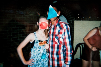
The content of my work shows old 35mm camera snap shot style images from parties when I was in my young teen age years, then cutting out white paper into different shapes and printing finger prints onto them, then covering the faces in the images. I chose the snap shot style photographs as they show the subjects  behaving naturally thus showing there personalities more, making a more intriguing images.

The context of my work stems from personal experiences I have been through and are still going through; the way we are perceived  by others and how its affects they way one behaves, dressed and makes certain life choices. As human beings we judge people very quickly and are quick to put people into certain boxes to make it easy for ourselves to understand.

Within the concept I wish to explore these immediate decisions we make about other people by taking away the subjects face and replacing it with my finger print in order to show 2 things:

  1. That I’ve looked back on the memories and left my mark on the people and places of my past.
  2. Allowing the audience to build a narrative all of their own and by using other aspects of the image to do so.

The outcome is for the audience to take time to consider who the subject could be and what they are representing rather than coming to quick conclusions based on just one element.  Being able to see more than just the face lets them absorb the image has a whole and get a feel of the environment and the people in it.


Artist Profile 5) Martin Parr

Martin Parr is a British photographer who’s style of photography has changed and influenced photographers all around world and has contributed massively into creating a genre of photography all of his own, snapshot photography. Born in 1952 England, his childhood saw an increasing view of social class and change and so followed in his grandfathers footsteps exploring and tackling these changes with his raw approach.

He studied photography at Manchester Polytechnic from 1970-1973 and was part of an up and coming new generation of documentary photographers, others included Daniel Meadows and Brian Griffin, they called themselves the New British Photographers and worked together on various different photography projects together. After he then married and moved to West Yorkshire where for 5 years he stuided the Methodist Baptist church and the isolated farming families that surrounded them, he used black and white as a tool to be seen as an adult professional photographer which worked as this work called The Non-Conformists was picked up art critics and exhibited widely at the time.

The work I am interested in came after, the series called ‘ the working class- The Last Resort 1982-1985, this collection of work was shot on a 35mm camera with use of heavy saturation and macro lens looks at leisure, communication and consumption.  He took the images in New Brighton England and was inspired by American Photographers like Joel Meyerowitz, William Eggleston and Stephen Shore to use garish bold colours to help convey his themes and explain that his photographs are all about societies exaggeration upon social classes and to change the idea that professional photography has to be in black and white only to be taken seriously.

Martin Parr 38

All these images are untitled but taken from the collection, the working class- The Last Resort.

These images are really symbolic of the time, the USA was having a huge impact on the way British people were viewing consumption as it was the first time after the wars where food, material and money was cheap and in plenty of supply. He puts his subjects underneath a microscope and allows them to flourish in their own chosen environment and capture their behavior as it happens naturally. Parr’s images are not trying to directly imply a strong message about the people within the images, he simply documented them in a certain style which enables us to take a step back and see what he wants us to. This is a very effective use of photography and is enables for Parr to take regular holiday style photographs which have enormous depth and a dash of criticism and sarcasm to them.

His images make the audience see a reflection upon themselves as most of the working class people are or have been in these situations and scene and so can easily relate and understand the people in the images and maybe feel embarrassed to think that that could have been them. He makes the audience feel guilty that they are contributing to this consumerism life style and allows them to assess their behavior and question whether or not they want to be a part of it.

The colours are so rich and powerful that even if you don’t see yourself within the images the colour will draw you in and catch your immediate attention. The images look how the scenes would appear if you was wearing sun glasses on a sunny day. The angles of the images are also very interesting as Parr has taken careful consideration into how he wants the audience to judge and empathize the people within the image and so uses composition and angles to do convey this. His stark and dry sense of humor is also shown within the images as he chooses to take the photo at purposely times, showing people eating or shouting, to really convey the animistic value hes trying to compare and make similarities too.

His images have been as great inspiration to my work as photographing snap shot style saturated images are something that can either look really awful and miss the point or can be an effective way of capturing charismatic moments that the disposable elements highlight better than a DSLR ever could. I will be using the bold colours as a choice thanks to Martin Parrs collection and choice the images which are most entertaining and convey the same humor as Parr.

Referencing:

Websites :

http://www.magnumphotos.com/C.aspx?VP3=CMS3&VF=MAGO31_9_VForm&ERID=24KL5357TF

Introduction

Books:

Title: Martin Parr : the non-conformists Author: Parr, Martin ; Parr, Susie writer of added commentary, Statement of Responsibility: photographs by Martin Parr ; text by Susie ParrPublisher: Aperture , Creation Date: 2013

Title: The last resort : photographs of New Brighton Author: Parr, MartinStatement of Responsibility: photographs by Martin Parr., Edition: Rev. ed. / introduced by Gerry Badger, Description: Previous ed.: 1998, Publisher: Dewi Lewis ,Creation Date: 2009

Title: Martin Parr : by Sandra S. Phillips, Author: Phillips, Sandra SCity of publication: London , Publisher: Phaidon Press, Creation Date: 2007

Title: The cost of living, Author: Parr, MartinStatement of Responsibility: photographs by M Parr ; texts by R Chesshyre, Publisher: Cornerhouse, Creation Date: 1989

Title: Martin Parr, Author: Williams, ValCity of publication: London , : Phaidon Press, Creation Date: 2002

Journals:

Title: Shooting the consumer; Martin Parr.(Features), Author: Peter HamiltonIs Part Of: Sunday Times (London, England), July 2, 1995, p.21

Title: Going Nowhere: Tourist Practices and Photographic Representations of Tourists in Small World by Martin Parr, Author: Nilsson, MariaIs Part Of: Journeys, 2, 2, 79-97(19) , Creation Date: 2001

Artist Profile 4) Jonathon Lewis

Jonathon Lewis is a British photographer who’s work heavily deals with themes such a consumerism, pixelation and western culture’s obsession with greed our need of always wanting more of what we cant have. Lewis was born in 1970 and studied History of Art and Professional Photography Practice at London College Of Printing, so with these studies behind him he knew where photography came from and also where it was going in teh future.

The series that I’m interesting in is called ‘Designer Labels’ from 2009:

 Dolce and Gabbana, 2009
Gucci, 2009

Krizia, 2009

As you can see with his film noir styled images, he has taken what we are exposed to on a day to day basis by campaigns and advertisements in news papers, magazines, on the internet and on television, and taken us out of our comfort zone by pixelating the images as symbolism for the audience to take another look at what us as western consumers are spending our money on.

The images provoke the audience as it taunts us with an image which we in fact cannot actually see, as humans this frustrates and irritates us, thus creating a very entertaining and integrating image. As we see shop windows in our daily life us an audience are able to fill in the blanks as we end up constructing what we assume what the window and clothes would look like, allowing the audience to see what they want and filling in the blanks.

All of the images were taken at night which is a time where as consumers we are not used to seeing them in, we are used to viewing these windows during the day when the shop has got all the lights on and it appears to be a wonderful place of beauty. By taking these images at night creates a really dark and seedy atmosphere which is not the ideology that we are used to thinking about these brands and windows in. I think this is a very important part of the images as it takes us even further away from the way we usually view these scenes.

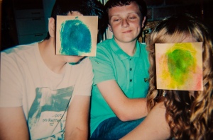
The use of pixallation is what really makes these images special as it is a used a kind of diffuser between the audience and the windows, it allows us to take a step back and see the brands for what they are and how much we actually spend. This is what has inspired me to use a square and cover up the faces of the people within my images, it allows us to scan the images for other clues about the person or situation. We then pick up on smaller details the image hold, details that we might not have previously seen if the face was uncovered.

Within my work I wish to hold to same qualities of Lewis’s work in respects too the way his images provoke the audience and make them think twice about what they viewing and leaving small clues around the images in order for the audience to fill in the blanks.

References:

websites :

http://www.hfgallery.org/jonathan-lewis/

http://www.jgdlewis.com/Designer%20Labels%20Page%20Large.html

http://www.jgdlewis.com/Bio.htm

Peer Feedback

We had a peer feed back session which very helpful for me to see if the audience would understand my concept and like the images I’ve created. I got mostly positive feed back from the session and also some suggestions to what could make them better.

_DSC1036 _DSC1041 _DSC1040 _DSC1039 _DSC1038 _DSC1037

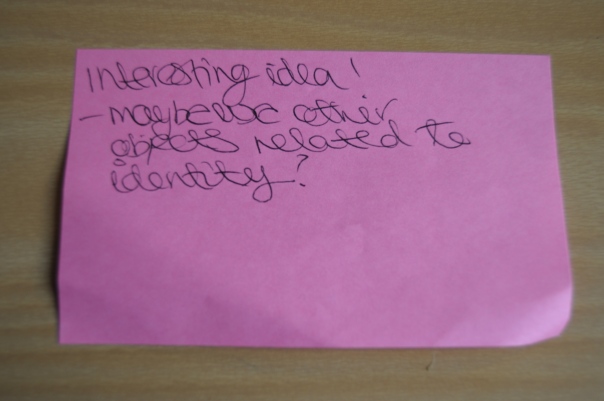
From the feedback given, most people have suggested that I images that have more signals which would let the audience see more information about the people in the images. They wanted more personal objects to convey their personalities as their faces are hidden. I understand these ideas would make it easier for the audience to understand, however all these images were taken at house parties in my youth and are snap shot photographs, my idea is for me to look back on memories and and leave my stamp on the people that were close to me at the time. So none of the images I have show any personal objects, however by taking away the face everything else in the image gets heightened, also the people in the images have drunk alcohol and so they are relaxed and let their wild side out, which means for an entertaining image.

Other suggestions mentioned were about the different techniques that I could incorporate the fingerprints into the images, like using a very dense fingerprint over the face rather than a white box and then a finger print. I like the use of the shape over the face. As you can see with my experimentation I have used different shapes but a square is what feels right to me as it shows the hole fingerprint and comes from my cubic inspiration.

Artist Profile 3) Judith Ann Braun

Judith Ann Braun is 65 who lives and works in New York, she is a  contemporary finger painter who uses her own finger prints and identity as her medium. She uses large scale white paper, walls and canvas’s’s to create her amazing design and uses black charcoal to paint with as is shows her finger prints in the most successful way and enables her work to have high contrast and a big impact when viewing.

Her early work was very controversial among art critics and the public, as she created sexually explicit piece for the New Museum of Contemporary Art in New York which contained a  13ft tall Blue Penis.  Other work of hers would explore these themes and has created a divided opinion within the art world. However, her recent work has taken a different course as she now is interesting in large landscapes inspired by the Virginia countryside.  Within this work Braun works with 3 rules:

  • The images she creates must be abstract
  • Symmetrical
  • And make be made from charcoal

These images come from her first collection in 2003 called  ‘Symmetrical Procedures’

Finger tips: Braun rejects the conventional equipment used by artists and uses just her fingertips to create wild, symmetrical and imaginative designs

Design rules: Braun sets just three criteria for her work - they must be symmetrical, abstract and in a carbon-based medium

Her work deals with themes such as identity through pattern, form and memory.

Wild wall: The full extent of Braun's landscape at the Chrysler Museum of Art

This image is called Wild Wall and is the image that grabbed me into her work. This symmetrical style of art would have been much easier to create if she uses a constant source like a stamp so every mark on the wall would be the same. However her use of all 10 finger prints suggests to me that she wants to embody the work shes making as with every image she literally leaves a memory or a piece of her personality within the art.

Her work isnt a straight forward finger print on a wall, she manipulates her prints into making swirls, lines, dots and smudges, conveying to the audience that someone cannot be read simply and easily. You have different versions on yourself which you can use in different ways in different situations. I also think that with the patterns she creates, she paints a physical representation of her self and by using yourself as the medium she exposes us to this concept and literally read her.

She has inspired me to use my finger prints rather than a word or icon as the images that I am printing onto are all images taken from my young teenage years which are memories to me now. I wish to do as Braun and leave my own mark on my work as symbol of memory and leaving pieces of me among past friends.

References:

Websites: 

http://www.dailymail.co.uk/news/article-2234831/Judith-Ann-Braun-Artist-uses-just-fingerprints-create-huge-murals-charcoal.html

http://judithannbraun.com/

http://judithannbraun.com/462250/bio/

http://enpundit.com/judith-ann-brauns-fingers-are-magical/

A3 Poster Design

Here are 2 design ideas for my final A3 image, I have made 2 designs one portrait and one landscape.

A3 PRINTUntitled-1

I like both designs and are having a trouble choosing which I prefer, I think I will carry on designing and printing them out, then put them up on a wall and see which I think conveys the project the best. I will ask my peers what there opinions are in order to make an accurate decision.

Experimentation Round 5)

I went back to my original plan of using squares:

_DSC1003 _DSC1006_DSC1005

I was also told in my feedback that  I should use photographs that less staged, however to be able to get a clear finger print I need an image that has big enough heads to fit them onto. This is why staged images are best for clear print making. However I do agree with the feed back and will be making a effort to figure out a compromise by using other shapes and maybe taking fresh images in order to make them work.

I really like the image of the boy on the floor with the bag over his head, it has a comedic value that these snap shot style images need. I also think the print works well with the size of the image and the ink density has worked well. I used a light blue colour as a finger print as there are other blues included in the image, so to tie them all together I used a similar colour.

Experimentation Round 4)

After the feed back I received about my works so far I decided to experiment with different shapes and colours to cover the face. Here is what I have created:

_DSC1004

_DSC0211

_DSC1008

I like the triangle shapes in the bottom image but I don’t think you can allocate a set shape for all of them as they are all different and vairy in composition and sizing. The circle as a shape isn’t strong enough for my concept as you cannot fit enough the figure print into the shape and it is also hard to get cut perfectly.

I think that the bottom image works much better with triangles as the composition works well with them. I think that squares may be too cubic within the image. The colours that I chose all have relevance to the image, by selecting a colour that’s already in the image to bring them both together.

I think I am going to see what shape and colour I feel fits each image and carry on.